Neo Deco Coloring: The Art Deco Coloring Techniques Guide for Modern Artists
There is something undeniably magnetic about the visual language of Art Deco. Geometric precision, bold symmetry, gilded luxury, and a confident sense of ornamentation that still feels current nearly a century after its peak — this is a design vocabulary that refuses to fade. Today, neo deco coloring has emerged as one of the most compelling movements in contemporary illustration and adult coloring culture, blending classical Art Deco coloring techniques with modern tools, digital sensibilities, and a new generation of artistic intention.
Whether you are approaching Art Deco coloring pages for the first time or you are an experienced illustrator looking to deepen your command of the style, this guide covers everything you need to understand the philosophy, palette, layering methods, and the expressive possibilities that Art Deco coloring offers.
What Is Neo Deco Coloring?
Neo deco coloring is the contemporary application of Art Deco coloring techniques — not merely reproducing the past, but reinterpreting it. Where traditional Art Deco design was shaped by the 1920s and 1930s obsession with modernity, machine aesthetics, and the glamour of a new industrial age, Neo Deco takes those same structural principles and infuses them with current artistic sensibilities.
This means the color palette may extend beyond the original gold-and-black or ivory-and-teal combinations. It may incorporate iridescent hues, hand-applied holographic shimmer, or digitally produced gradients that echo the sunburst patterns of original Deco architecture. The geometry remains foundational — chevrons, stepped forms, fan shapes, elongated figures, and floral stylization — but the coloring approach becomes a conversation between past and present.
For artists working with Art Deco coloring pages, Neo Deco coloring offers a framework that is simultaneously structured and expressive. The lines are already there; the geometry provides a scaffold. What Neo Deco brings is the courage to color outside the expected palette.
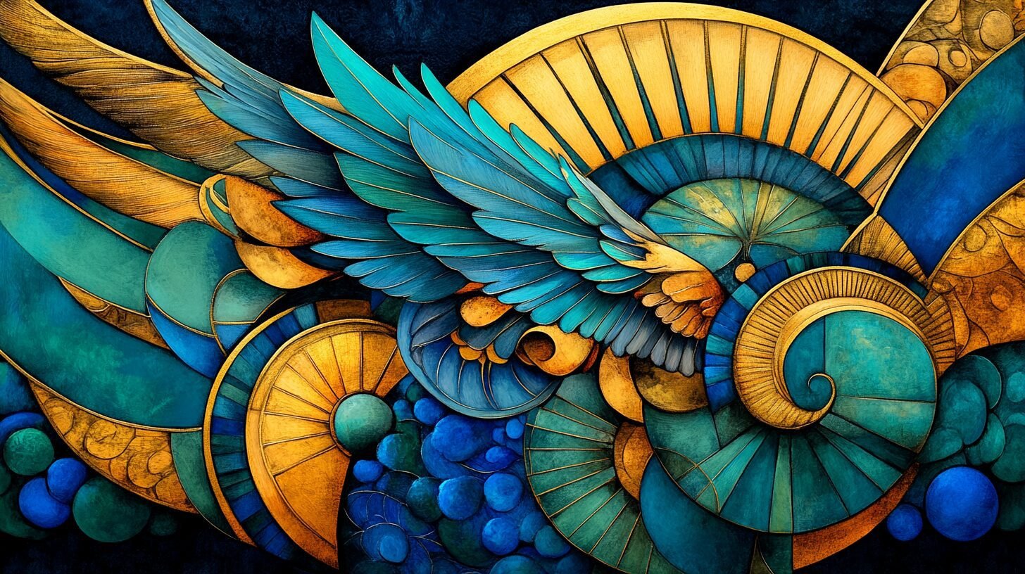
The Core Art Deco Color Palette
Before you can master Neo Deco coloring, you need to understand the base palette from which all Art Deco coloring techniques derive their power.
Build a geometric palette with the contrast ratios Art Deco demands
Gold and metallic tones are the most iconic. Deep gold, antique brass, burnished copper, and champagne tones define the period’s luxury aesthetic. In contemporary practice, these are often achieved with metallic-colored pencils, gold gel pens, or Posca markers, or — in digital work — using layer blend modes like “overlay” or “soft light” over warm yellow-ochre base layers.
Rich jewel tones serve as the chromatic counterpoints to all that gilding. Emerald green, sapphire blue, ruby red, and amethyst purple appear throughout the original Art Deco design. These are saturated, confident hues — not pastel, not washed out. When coloring Art Deco coloring pages, choosing high-saturation, medium-to-dark-value colors preserves that characteristic boldness.
Black, ivory, and cream provide structural neutrals. The heavy outlines of Art Deco illustration are often black, and the background fields tend toward deep black or pale cream, creating maximum contrast.
Coral, terracotta, and dusty rose appeared in later Deco work, influenced by Orientalist and Egyptian Revival motifs. These warmer, earthier tones work beautifully in neo deco coloring as transitional bridge hues between the cooler jewel palette and the warmer metallic one.
Art Deco Coloring Techniques: The Essential Methods
Mastering Art Deco coloring is fundamentally about mastering flat planes, sharp transitions, and deliberate light sources. Unlike painterly or impressionistic approaches, Art Deco coloring techniques favor clarity over blending ambiguity.
1. Flat Color Blocking
The most foundational technique in Art Deco coloring is flat color blocking. Each geometric section receives a single, even tone with no visible gradation or texture. This creates the crisp, graphic quality that makes Deco illustration so immediately recognizable.
In practice with colored pencils, this requires patient layering with consistent light pressure, building up pigment slowly until full opacity is reached. With alcohol-based markers, flat color blocking is more direct — a single pass achieves coverage, though edge control along geometric borders requires a slow, deliberate hand.
For Art Deco coloring pages, flat color blocking works best when you map your palette before you begin. Assign each zone a specific color before touching pencil or marker to paper, and maintain that assignment rigorously throughout. The coherence of the piece depends on intentional, pre-planned color relationships.
2. Controlled Gradation and Ombre Effects
While flat blocking is foundational, neo deco coloring frequently incorporates controlled gradation — particularly within larger geometric fields. The key distinction is that Deco-influenced gradation is always linear and directional, never organic or cloud-like.
Sunburst patterns, a hallmark of the style, lend themselves to radial gradation — transitioning from deep gold at the center to warm amber or pale cream at the outer rays. Fan and shell forms transition from deep jewel tones at the fold to lighter values at the tips. These gradations follow the geometry; they never dissolve it.
With colored pencils, burnishing one color into another achieves smooth transitions. With markers, a wet-on-wet blending technique using a colorless blender creates soft gradient passages within defined geometric zones. In digital art, linear gradient fills maintain the pattern’s structural integrity while adding visual depth.
3. Metallic Effects and Highlighting
One of the most distinctive characteristics of neo deco coloring is the pursuit of surface luminosity. Original Art Deco objects — furniture, jewelry, architecture — were made of materials that caught and reflected light: chrome, lacquer, gold leaf, mirrored glass, polished ebonite. Capturing this in two-dimensional Art Deco coloring work requires a deliberate highlighting strategy.
The standard technique involves three values: a deep shadow tone, a mid-range base color, and a bright highlight, typically pure white or metallic silver-white. On a gold field, this might look like: deep ochre-brown in recessed areas, medium warm gold as the primary tone, and pale cream or white at the ridge of each geometric form. The transitions between these values should be crisper than in naturalistic illustration — Deco light sources are idealized, theatrical, and architectural.
Gold gel pens and white gel pens are essential tools for neo deco coloring artists working in traditional media. A carefully placed white highlight line along the edge of a chevron or stepped border immediately elevates the piece from decorative to luminous.
4. Pattern-Within-Pattern Coloring
Art Deco design frequently nests smaller patterns inside larger structural forms — crosshatching within chevrons, dot fields within fan shapes, fine geometric grids within broad decorative bands. Neo deco coloring activates this layering by assigning each pattern level its own color logic.
The outer structural elements might be rendered in deep jewel tones. The inner pattern layer might use metallic or lighter tones. Background fill might receive the darkest values of the palette. This three-level depth system creates visual richness without losing the overall graphic clarity.
When working on Art Deco coloring pages with nested pattern detail, a fine-tipped marker or a sharpened colored pencil point is essential for maintaining clean edges at the innermost pattern level. Any blurring or overflow at this scale compromises the precision that defines the style.
5. Contrast and the Role of Negative Space
Perhaps the most underappreciated of all Art Deco coloring techniques is the deliberate use of uncolored or minimally colored negative space. In original Deco posters, the bold contrast between a fully rendered figure and a stark, flat background was not laziness — it was compositional strategy. The negative space gave the geometric subject room to breathe and reinforced its silhouette.
In neo deco coloring, this translates to a willingness to leave large areas in a single flat tone — or even the white of the paper — while concentrating the most complex coloring work in the focal geometric forms. Resist the impulse to fill every section with intricate textures or gradients. Restraint amplifies impact.
Learn the complementary contrast principles behind every great Neo Deco piece
Working With Different Media on Art Deco Coloring Pages
Art Deco coloring pages respond differently depending on the medium you choose, and understanding these interactions elevates your results significantly.
Recommended for This Topic

Neo Deco Easter Coloring Book – Art Deco Calm for Adults
Alcohol markers suit Art Deco coloring pages with a smooth, uncoated paper surface. They deliver the flat, glossy color fields that closely approximate the look of original Deco poster printing. Their speed encourages decisiveness, which aligns well with the bold, non-tentative character of the style. Layering complementary colors with alcohol markers produces the jewel-tone depth that neo deco coloring demands.
Colored pencils offer the most control for fine-detail geometric work. Wax-based pencils burnish beautifully for metallic effects; oil-based pencils layer cleanly for flat color blocking. A colorless blender pencil is essential for smooth gradients within Deco fan forms and sunburst elements. High-quality colored pencils on a slightly textured paper surface produce the richest color saturation.
Watercolor brings a different energy to Art Deco coloring, and in the Neo Deco tradition, it has found a meaningful place. The technique requires a disciplined wet-on-dry approach — flooding each geometric cell with clean color and allowing it to dry completely before advancing to the adjacent sections. When executed well, watercolor Art Deco coloring achieves a luminous, slightly translucent quality that feels contemporary while honoring the palette traditions of the period.
Digital tools have perhaps done more than any other medium to drive the neo deco coloring movement. Software enables perfect flat color fills, precise geometric masking, metallic texture overlays, and unlimited palette experimentation — all without the risk of overworking a paper surface. Many contemporary neo-deco artists begin compositions digitally and then translate them into traditional media, or combine both in mixed-media practice.
What a wonderful perspective on the calming nature of art.
I appreciate how this focuses on the joy of the creative process.
Neo Deco is exactly the modern aesthetic I’ve been looking for. The geometric precision is satisfying to color.
The Art Deco revival in these pages is stunning. Glamorous but approachable for intermediate colorists.
Recommended these to my sister who has been going through a difficult time. She found them helpful and creative, which was exactly what I hoped.