Art & Emotions: Using Color to Explore Feeling
Have you ever noticed how a vibrant yellow can lift your spirits, or how a deep blue seems to wash over you with calm? The relationship between art and emotions is profound and ancient, woven into the very fabric of human expression. When we pick up colored pencils, markers, or crayons, we’re not just filling in shapes—we’re translating the invisible language of our inner world into something tangible and real.
Color has the remarkable ability to bypass our logical mind and speak directly to our feelings. This connection between color and emotions in art isn’t just poetic imagination; it’s rooted in psychology, neuroscience, and centuries of artistic practice. Whether you’re exploring mindful creativity for the first time or deepening your existing practice, understanding how to use color as an emotional tool can transform your artistic journey into a powerful form of self-discovery and healing.
The Psychology Behind Color and Emotions in Art
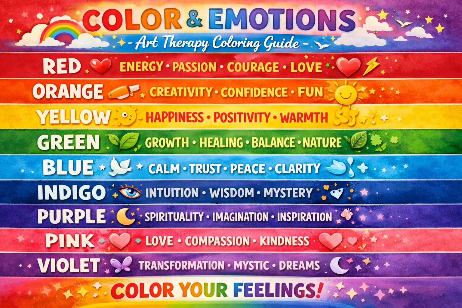
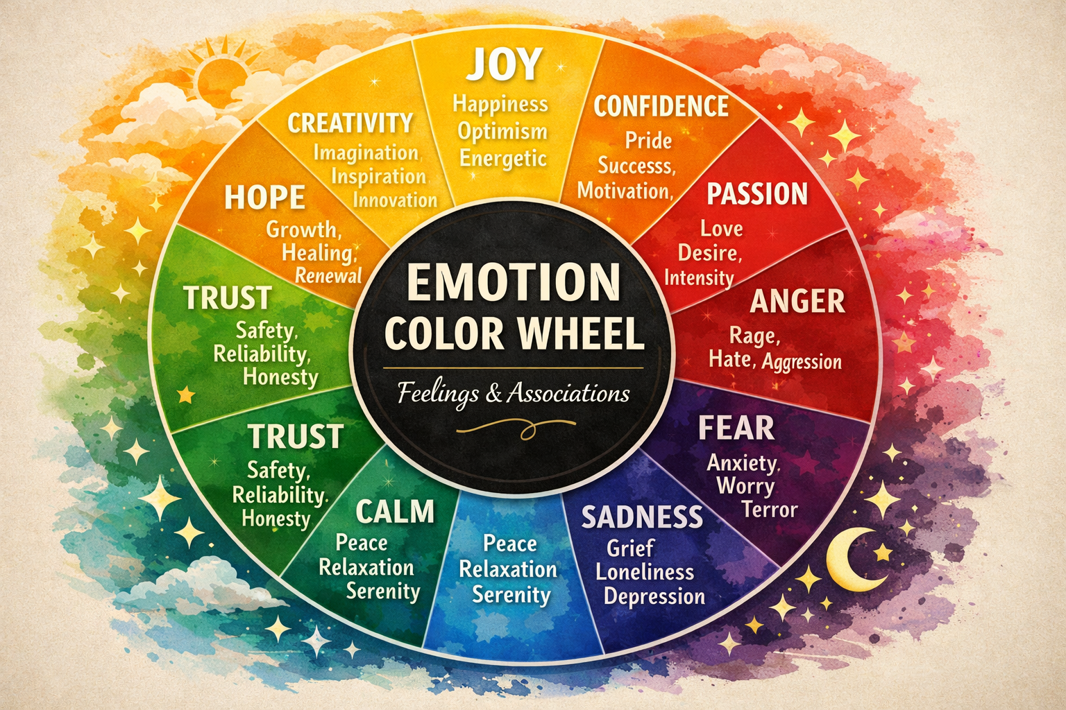
Every color carries its own emotional weight—red pulses with energy, passion, and sometimes anger. Blue soothes and calms, evoking tranquility or melancholy. Yellow radiates joy and optimism, while purple suggests mystery and spirituality. These associations aren’t arbitrary—they’re shaped by nature, culture, and our personal experiences.
When we use color to express emotions, we tap into a universal language that transcends words. A child who scribbles furiously in red may be processing anger or excitement. An adult who gravitates toward soft pastels during a coloring session might be seeking comfort and peace. The colors we choose reveal what we’re feeling, often before we can articulate it ourselves.
This is why art therapy coloring has become such a valuable practice for mental health and emotional wellness. Through the simple act of selecting and applying colors, we create a safe space to explore, acknowledge, and transform our emotional landscape. As discussed in our guide on Mindful Creativity & Wellness, this practice nourishes your inner world in ways that words often cannot.
Understanding Your Color and Emotions in Art Vocabulary
Before you can use color as an emotional tool, it helps to develop your personal color vocabulary. While cultural associations exist—red for love or danger, green for growth or envy—your individual experiences shape how colors speak to you. Perhaps blue reminds you of childhood summers by the ocean, or orange evokes memories of autumn gatherings with family.
Creating your own emotional color and using an emotions guide in art can be enlightening. Take a quiet moment with your coloring supplies and ask yourself: What does each color make me feel? Don’t overthink it—let your intuition guide you. You might discover that yellow doesn’t bring you joy but rather anxiety, or that black isn’t depressing but grounding and powerful. There are no wrong answers in emotional expression through art.
The emotional vocabulary we build through color choices is one reason art therapists draw from a wide range of mindfulness and wellness techniques — including structured coloring practice.
Common Color-Emotion Connections
While your personal associations matter most, understanding traditional color psychology can deepen your practice:
Warm Colors: Red, orange, and yellow tend to energize and stimulate. They can represent passion, creativity, anger, or joy. When you’re feeling stuck or lethargic, reaching for warm colors can help energize your art and emotions.
Cool Colors: Blue, green, and purple are typically calming and soothing. They often relate to peace, sadness, healing, or introspection. If you’re overwhelmed or anxious, cool colors can help regulate your nervous system, as explored in our article on Benefits of Coloring for Stress Relief.
Neutral Colors: Brown, gray, and beige can ground and stabilize. They represent earthiness, wisdom, or sometimes emptiness. These colors provide balance and can help you feel more centered when emotions run high.
Black and White: Often seen as opposites, both hold powerful emotional significance. Black can represent mystery, elegance, or the unknown, while white suggests clarity, purity, or new beginnings.
Colour Psychology in Art (open-access PDF) – Scientific Research Publishing In Western contexts, red is often associated with anger and passion, blue with melancholy, and black with despair — but artists and viewers share a common cultural register in decoding these emotional associations.
Practical Techniques for Using Color to Explore Feelings
The Color Check-In Practice
Before you begin any coloring session, take a moment to check in with yourself emotionally. Close your eyes, take three deep breaths, and ask: “How am I feeling right now?” Without judgment, notice what art and emotions are present. Then, open your eyes and look at your color palette. Which colors are you drawn to? Which ones do you want to avoid?
This simple practice builds emotional awareness and bridges your inner experience and your artistic expression. You might make this part of your daily coloring ritual to create consistency in your emotional exploration.
To turn your emotional exploration into a daily creative ritual, try our Powerful Emotions Coloring Pages with Affirmations, combining expressive designs with uplifting messages.
Dive into our coloring techniques guide, designed to grow with you from beginner to advanced.
Emotion Mapping Through Color
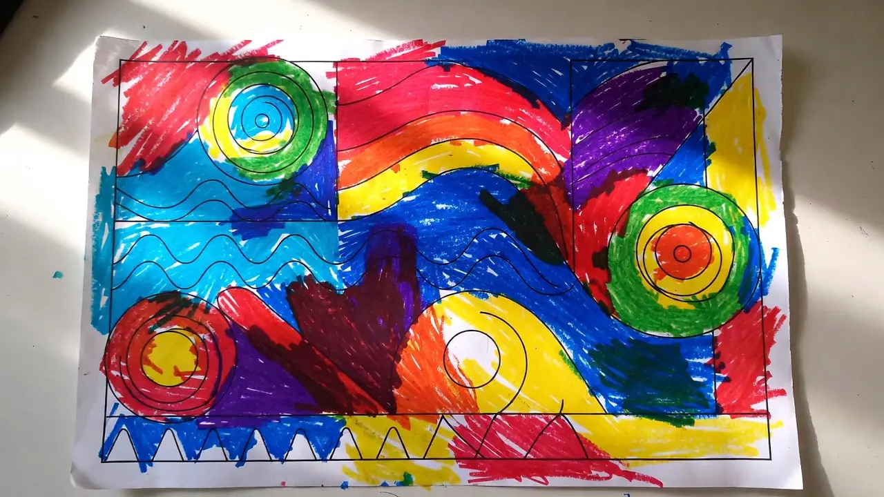
Try this powerful exercise: divide a blank page into sections—perhaps four quadrants or a circular mandala design. Assign each section to a different emotion you’re currently experiencing or want to explore. Then, intuitively color each section with the hues that represent those feelings to you.
You might fill one quadrant with angry reds and oranges, another with peaceful blues, a third with anxious yellows, and the last with hopeful greens. This practice, particularly effective when working with guided mandala practices, helps you acknowledge the complexity of your emotional life—nothing is ever just one feeling.
The Gradient Journey
Select two colors that represent contrasting emotions you’re experiencing or want to transition between—perhaps from the anxiety of yellow to the calm of blue, or from the heaviness of gray to the lightness of pink. Create a gentle gradient between them, blending the colors slowly and mindfully.
This technique mirrors the emotional journey itself. Feelings aren’t switches that flip on and off; they flow, blend, and transform. As you blend your colors, breathe deeply and imagine your emotions shifting with the same gentle progression.
Building a Sustainable Emotional Coloring Practice
Integrating art and emotional work into your routine requires intention and gentleness. Start small—even five minutes of mindful coloring can shift your emotional state. Consider pairing your color exploration with creative journaling practices to deepen your insights.
Create a comfortable space for your emotional art practice. Gather quality materials that inspire you to return to this work regularly. You don’t need expensive supplies—what matters is having tools that feel good in your hands and colors that sing to your soul.
Recommended Coloring Resources for Emotional Exploration
To support your journey of using color to express emotions, consider these beautifully designed resources:
Printable Mandala Coloring Sheets for Adults offer symmetrical designs that are perfect for meditative, emotional work. The repetitive patterns help quiet the mind while the open spaces invite colorful emotional expression through art.
Floral Coloring Pages provide organic, flowing designs that connect us to nature’s emotional language. Flowers have their own color symbolism—roses for love, violets for faithfulness, lilies for peace—adding another layer to your emotional exploration.
Motivational Quotes Coloring Pages combine the power of affirming words with color therapy. As you fill in letters and designs, you’re literally coloring positive emotions into your consciousness.
When Difficult Art and Emotions Surface
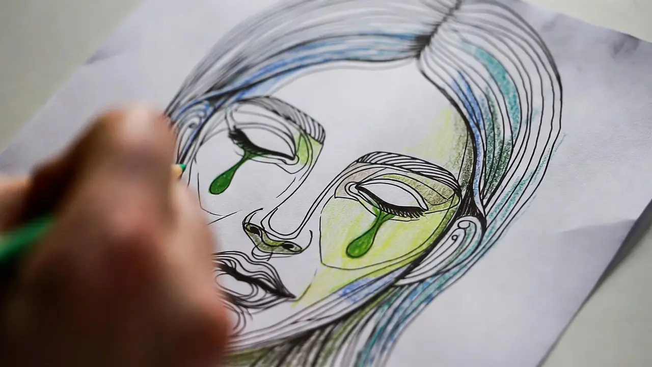
Sometimes, art therapy coloring brings up challenging feelings. This is not only normal—it’s often a sign that the practice is working. Your emotional world is asking for attention. When difficult emotions arise during coloring, resist the urge to push them away or judge yourself.
Instead, breathe into the feeling. Let your color choices reflect what you’re experiencing, even if it means covering a page in dark, heavy colors. This is a release. This is processing. This is healing. You might scribble aggressively or press hard with your colors. Allow it. The paper can hold what you’re feeling.
If emotions feel overwhelming, it’s perfectly acceptable to pause, step away, or shift to a more structured activity. Some days call for the soothing predictability of mandala patterns; other days require the freedom of abstract color play—honor where you are.
Recommended for This Topic
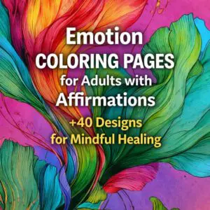
40+ Emotion Coloring Pages for Adults – Mindful Healing & Affirmations
35 Mindfulness Coloring Pages for Adults | Instant PDF Download
Color, Emotions, and Meaning: How Professionals Use Color in Art Therapy – Mimi Panda In clinical practice, color meaning is client-centered, not “decoded” from a single symbol — a single drawing or color should never be used to label someone’s mental state, as art therapists treat artwork as part of a living conversation.
Tracking Your Emotional Color Journey
Consider keeping a color journal alongside your artistic practice. After each coloring session, jot down a few notes: What colors did you use? How were you feeling before, during, and after? Did any insights or memories surface? Over time, you’ll begin to notice patterns in your emotional color choices.
You might discover that you always reach for purple when processing grief, or that orange appears frequently when you’re feeling creative and alive. These patterns are unique to you and provide valuable self-knowledge. They become a personal emotional map that guides you toward greater self-understanding.
Sharing Your Emotional Art (Or Not)
The choice to share your emotional color work is entirely personal. Some people find deep value in keeping their art therapy coloring private—a sacred space just for themselves. Others discover healing in sharing their creations with trusted friends, family, or online communities.

There’s no correct answer. What matters is that you feel safe in your practice. If sharing helps you process and connect with others who understand, wonderful. If privacy allows you to be more honest and vulnerable with yourself, that’s equally valuable. You can trust your intuition.
Expanding Your Emotional Color Practice
As you grow more comfortable with using color to express emotions, consider experimenting with different approaches:
Try color limitation exercises where you only use two or three colors for an entire piece. This constraint can deepen your relationship with specific emotions and help you discover subtle variations within a single color family.
Explore seasonal color work that aligns with the emotional qualities of different times of year. Spring’s fresh greens and pinks might reflect hope and renewal, while autumn’s oranges and browns could represent harvest and introspection.
Experiment with complementary color therapy by pairing opposite colors on the color wheel—red and green, blue and orange, yellow and purple. These high-contrast combinations can help you hold opposing emotions simultaneously, building capacity for emotional complexity.
The Transformative Power of Color and Emotion
When we combine color and emotions in art, we create more than beautiful pictures. We have a dialogue with ourselves. We externalize the internal. We give form to the formless. This is the profound gift of art therapy coloring—it transforms abstract feelings into concrete, visible expressions that we can then witness, understand, and ultimately release or integrate.
Every time you sit down with your coloring pages and consciously choose colors based on your emotional state, you’re engaging in a powerful act of self-care. You’re saying: “My feelings matter. They deserve attention. They deserve expression.” In a world that often asks us to suppress or ignore our emotions, this is revolutionary.
Beginning Your Journey Today
You don’t need to wait for the perfect moment or the perfect supplies to begin exploring emotional expression through art. Start now, wherever you are, with whatever you have. Even a simple box of crayons and a printed coloring page can become a portal to profound self-discovery.
The journey of using color to explore feeling is ongoing and ever-evolving. Your relationship with colors will deepen over time. Emotions that once seemed overwhelming may become familiar friends. Colors you once avoided might become sources of comfort and strength.
Remember, there’s no destination in this practice—only the continuous, compassionate act of showing up for yourself, one color at a time. Your emotions are valid. Your experience is real. And art is here to help you honor both.
🎨 Not sure where to start?
Here are our most loved products.
Frequently Asked Questions: art and emotions
🎨 Not sure where to start? Here are our most loved products.
Q1: How are art and emotions connected?
A: Art and emotions are deeply intertwined because creative expression allows people to translate feelings into visual form. Through shapes, textures, and especially color, artists communicate moods that viewers can instantly sense. This emotional connection is why art can feel calming, energizing, or even unsettling without using any words.
Q2: What is the role of color and emotions in visual art?
A: Color and emotions work together to influence how a piece of art is perceived. Warm tones often feel energetic or passionate, while cooler shades can create a sense of calm or reflection. Artists intentionally choose color combinations to guide emotional responses and create a specific atmosphere within their work.
Q3: How does color and emotions in art affect viewers?
A: Color and emotions in art can shape how viewers interpret and react to an image. Certain hues may trigger personal memories or cultural associations, making the experience unique for each person. This emotional impact is one of the reasons visual art can feel so powerful and memorable.
Q4: What is color psychology emotions in art?
A: Color psychology emotions refers to how different colors are believed to influence human feelings and behavior. In art, this concept is used to create mood and meaning. For example, softer tones may promote relaxation, while bold contrasts can create excitement or tension.
Q5: Why do different colors evoke different emotions?
A: Different colors evoke different emotions because of a mix of biological responses and learned associations. Over time, people connect certain colors with experiences, environments, and cultural meanings. Artists use this understanding to create emotional depth and guide the viewer’s interpretation.
Q6: Can color choices change the meaning of an artwork?
A: Yes, color choices can completely transform the meaning of an artwork. The same composition can feel joyful, dramatic, or mysterious depending on the palette used. This is why artists often experiment with multiple color schemes before finalizing a piece.
Q7: How can beginners use color psychology emotions in their own art?
A: Beginners can start by observing how different color combinations make them feel and applying those insights to their work. Trying simple palettes, limiting color choices, and practicing with mood-based themes can help build confidence. Over time, this approach makes it easier to express emotions intentionally through art.
Q8: Is the connection between color and emotions universal?
A: While some emotional responses to color are widely shared, many interpretations are influenced by culture and personal experience. This means that the same artwork may evoke different feelings in different viewers. Understanding this adds depth and flexibility to artistic expression.
Q9: How do artists plan color and emotions in a composition?
A: Artists often begin with a mood or message in mind and then select colors that support that intention. They may use contrast, harmony, or repetition to guide the viewer’s eye and emotional journey. This planning process helps create a cohesive and meaningful final piece.
Q10: Why is understanding art and emotions important for creativity?
A: Understanding art and emotions helps artists communicate more effectively and connect with their audience on a deeper level. It allows creative choices to feel intentional rather than random. This awareness can improve both artistic skills and the work’s overall impact.
Conclusion: Understanding Art and Emotions Through Color
Art and emotions are inseparable, shaping how we create, experience, and interpret visual expression. By exploring the relationship between color and emotion, artists gain a powerful tool for communicating mood, meaning, and atmosphere without relying on words. Every shade, contrast, and combination contributes to how a piece feels as much as to how it is seen.
Understanding color and emotions allows both beginners and experienced creators to make more intentional choices. Whether using bold, vibrant palettes or soft, calming tones, the emotional impact of color can transform a simple composition into something deeply engaging and memorable. At the same time, viewers bring their own experiences, making each interaction with art unique.
As you continue exploring art and emotions, experimenting with color becomes an essential part of the creative process. The more you observe and practice, the more naturally you will be able to use color and emotions to express ideas, tell stories, and connect with others through your work.
Using color to explore emotions is powerful. This approach has helped me process feelings I couldn’t verbalize.
The emotional palette concept is fascinating. I never thought about choosing colors based on what I need to express.
These pages helped me rediscover a creative side I’d let go dormant for about twenty years. Simple but genuinely meaningful.