Shading & Texture Techniques for Coloring: Pro Tips for Depth & Realism
Whether you’re working on simple coloring pages or complex artistic designs, mastering shading and texture techniques can transform flat images into dimensional masterpieces. The difference between a good coloring page and a stunning work of art often comes down to how effectively you use light, shadow, and surface detail.
In this comprehensive guide, we’ll explore professional methods to help you shade coloring pages and add depth and visual interest through texture. These techniques build naturally on fundamental skills like color theory and blending, taking your coloring art to the next level.
Understanding Light and Shadow Fundamentals with Shading Techniques for Coloring
Before diving into specific shading techniques for coloring, it’s essential to understand how light behaves. Light creates highlights on surfaces closest to the light source, while shadows form in areas where light cannot reach. The transition between these areas—called the midtones—is where much of the magic happens in coloring, shading, and blending.
Consider the direction of your light source before you begin. Is it coming from above, the side, or at an angle? This decision will guide where you place your highlights and shadows consistently throughout your piece. Professional colorists often lightly mark the direction of their light source with an arrow in the margin as a reference point.
Essential Shading Techniques for Coloring
Layering for Depth
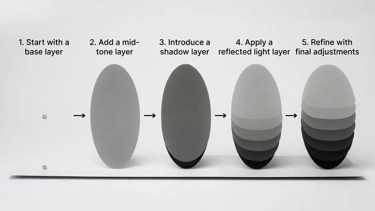
Layering is the foundation for effective shading tips of coloring pages. Start with light pressure and gradually build darker values through multiple layers. This approach gives you control and prevents harsh lines or mistakes that are difficult to correct.
Begin with your lightest color across the entire area you’re shading. Then, identify shadow areas and apply a slightly darker shade with light pressure. Continue building layers, each time covering a smaller area and using slightly more pressure or darker colors. This creates smooth, natural-looking gradients that give your work professional polish.
For those just starting, this layering approach is covered extensively in our guide to coloring techniques for every artist, which provides step-by-step foundations.
Burnishing for Smooth Finishes
Burnishing is a key shading technique for coloring that creates incredibly smooth, polished surfaces. By pressing a light-colored pencil or blending tool firmly over layered colors, you compress the pigment into the paper’s tooth, eliminating any graininess often seen with colored pencils.
To achieve the best results, complete all your color layers first. Then, using a white, cream, or colorless blending pencil, apply firm circular pressure over the colored area. This method not only smooths colors but also enhances coloring, shading, and blending, giving your artwork a professional, almost painted appearance.
Hatching and Cross-Hatching for Texture
For artists looking to add texture to their coloring art, hatching and cross-hatching are versatile techniques. Hatching involves drawing parallel lines close together, while cross-hatching layers lines in multiple directions to create depth.
Adjusting the spacing and pressure of your strokes enables nuanced shading. Darker areas receive densely spaced, heavier lines, while lighter areas have more open, softer strokes. These techniques are perfect for shading coloring pages with visible texture, ideal for rendering surfaces like fabric, wood grain, fur, or hair.
By combining shading techniques for coloring with texture techniques, you can elevate your coloring pages with both smooth gradients and rich, tactile detail.
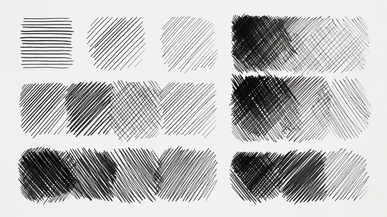
Stippling for Unique Effects
Stippling creates shading through dots rather than continuous strokes. Denser dot placement creates darker values, while sparse dots create lighter areas. Though time-consuming, stippling produces unique, textured results that work well for subjects such as stone, sand, or weathered surfaces.
For coloring pages, stippling works best with fine-tipped markers or sharp colored pencils. This technique also combines well with other methods—you might stipple texture in one area while using smooth blending in another.
Texture Techniques in Coloring
Texture gives surfaces character and realism. Different subjects require different texture approaches to look convincing and add visual interest to your work.
Creating Fabric and Cloth Textures
Fabric has folds, wrinkles, and varying surface qualities depending on the material. For smooth fabrics such as silk or satin, use the burnishing technique with sharp, light-to-dark transitions at fold lines. The highest points of folds catch the most light and should be your lightest values, while the deepest parts of folds are your darkest shadows.
For rougher fabrics like burlap or wool, incorporate subtle hatching or stippling to suggest the woven texture. Keep the texture consistent in direction—fabric texture generally follows the cloth’s drape. Skilled colorists working on intricate mandala designs often employ similar principles when adding dimensional elements to geometric patterns.
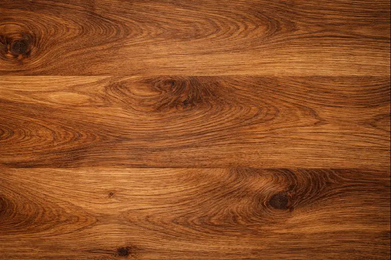
Wood Grain and Natural Textures
To add texture to wood-colored art, follow the wood’s natural grain with your strokes. Use long, flowing lines that curve slightly, varying the pressure to create irregular grain patterns. Layer different shades of brown, ochre, or gray to build realistic wood tones.
Start with a mid-tone base layer. Add darker grain lines, making some thicker and others thinner for variation. Then, add highlights between some grain lines with a lighter color to suggest raised grain or light reflection. The key is irregularity—nature rarely creates perfectly uniform patterns.
Fur and Hair Techniques
Rendering believable fur or hair requires patience and attention to directional flow. Always stroke in the direction the hair grows, using short, quick strokes that taper at the ends. Layer multiple colors to create depth—few animals or people have single-toned hair.
Begin with a light base layer in the dominant color. Then, add darker strokes for shadows, particularly where hair overlaps or creates depth. Finally, add highlights with a lighter color or white pencil on the uppermost surfaces where light hits.
For the best results, please use high-quality materials that support this level of detail. Our comprehensive materials guide can help you select the best tools for achieving professional texture effects.
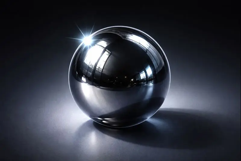
Metal and Reflective Surfaces
Metallic surfaces require high contrast and sharp edges to achieve a shiny finish. Unlike soft, gradual shading, metals often have sharp transitions between very light and very dark values. Identify your brightest highlights (which might be pure white) and your darkest shadows, then create relatively quick transitions between them.
For brushed metal, add subtle directional lines through the highlights and shadows to suggest the brushed texture. For polished metal, keep surfaces very smooth through burnishing, with distinct bright spots where light reflects directly.
Coloring, Shading, and Blending Strategies
Successful shading rarely happens in isolation—it works in concert with effective blending. The transition between colors and values determines how natural and three-dimensional your work appears.
Temperature in Color Shading
Shadows aren’t simply darker versions of the base color. Introducing color shading temperature variation creates more interesting, realistic shading. Cool shadows (with hints of blue or purple) paired with warm highlights (with hints of yellow or orange) create dynamic, eye-catching contrast.
This principle is directly tied to understanding the basics of color theory, where complementary colors and temperature relationships become powerful tools for shading. A warm yellow object might have cool violet shadows, while a cool blue object could have warm brown shadows.
Gradient Blending Techniques
Creating smooth gradients is essential for rounded objects and soft transitions. The key is patience—build your gradients slowly, layer by layer, rather than trying to achieve the effect quickly with heavy pressure.
Start with your lightest color and apply it with very light pressure. Gradually transition to your medium color, overlapping the application areas. Where colors meet, use small circular motions to blend the boundary. For more detailed instructions on mastering these skills, explore our dedicated guide to mixing colors like a pro.
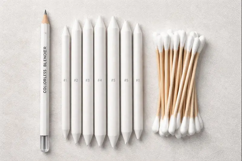
Blending Tools and Methods
Different tools create different blending effects. Colorless blenders work well with colored pencils, creating smooth transitions without adding color. Paper stumps or tortillons also work for blending pencils and pastels. For markers, you can use lighter marker shades to blend into darker ones while the ink is still wet.
You can experiment with different tools to discover which ones produce the effects you prefer in various situations.
Advanced Applications: Color Shading and Texture in Coloring Art
Creating Atmosphere and Depth
Objects in the distance appear lighter and less detailed than objects in the foreground—a principle called atmospheric perspective. Use this when practicing shading techniques for realistic depth in landscape coloring pages. Make distant elements lighter and softer, while foreground objects receive stronger color, shading, and blending, and more detailed textures. This approach helps you add natural texture to color art, making each scene more lifelike.
Combining Multiple Techniques
The most visually compelling coloring art often combines several texture techniques in a single piece. For example, use smooth burnishing for skin tones, stippling for a stone wall, hatching for fabric folds, and sharp metallic shading for jewelry—all in one image. When learning how to shade coloring pages, focus on selecting the proper technique for each surface rather than adding texture randomly. Each method should enhance realism and complement the subject matter.
Working with White Space
You don’t need to fill every inch of your page with color. Strategic white space can function as the brightest highlights, especially on glossy or reflective surfaces. Leaving small areas of pure white can create sparkling effects on water, glass, or dewdrops that are difficult to achieve with shading alone. This is a key principle when combining color, shading, and blending with texture techniques.
Recommended Products for Shading and Texture
Prismacolor Premier Colored Pencils (Set of 72)
These professional-grade pencils are perfect for practicing shading techniques for coloring. Their soft, blendable cores enable smooth coloring, shading, and blending, while the wide color range supports subtle shading variations. Burnishing delivers a polished finish, ideal for both beginners learning how to shade coloring pages and advanced artists looking to add texture to coloring art.Ohuhu Alcohol Markers (120 Colors)
Dual-tipped markers for versatile coloring, shading, and blending. The brush tip provides variable pressure and stroke width, while the chisel tip efficiently covers larger areas. Alcohol-based ink blends seamlessly, allowing you to experiment with shading techniques for coloring and layered textures.Strathmore Premium Mixed Media Paper
Heavyweight paper supports multiple layers without pilling or tearing, which is essential when applying various texture techniques during coloring. Its smooth yet dense surface holds pigments well, making it perfect for detailed coloring, shading, blending, burnishing, and realistic textural effects.
Related Articles to Shading Techniques for Coloring
Best Adult Coloring Books for Relaxation and Creativity: Discover coloring books designed specifically with shading and texture opportunities in mind, featuring designs that allow you to practice the techniques covered in this guide.
Digital Coloring Apps vs Traditional Coloring: Which is Right for You? Explore how shading and texture techniques translate to digital platforms, and whether digital tools might enhance or complement your traditional coloring practice.
🎨 Not sure where to start?
Here are our most loved products.
Frequently Asked Questions about Shading Techniques for Coloring
🎨 Not sure where to start? Here are our most loved products.
Q1: What’s the most straightforward shading technique for beginners to start with?
A: Layering is the most beginner-friendly shading technique for coloring. Begin with light pressure using a lighter color, then gradually build up darker layers in shadow areas. This method is forgiving because you can always add more pigment and naturally creates smooth transitions. Practice on simple shapes like spheres or circles before moving to complex coloring pages. Patience is key—multiple light layers yield better results than a single heavy application, and this approach is excellent for learning to shade coloring pages effectively.
Q2: How do I prevent streaky or patchy shading in my coloring pages?
A: Streaky shading often comes from uneven pressure or insufficient layering. To fix this, use light pressure and small circular motions rather than long back-and-forth strokes. Gradually build color shading through multiple layers rather than trying to achieve the final shade in one pass. For smoother results, you can burnish with a colorless blender or a light-colored pencil. This technique is essential for mastering coloring, shading, and blending without streaks or patchiness.
Q3: Can I add texture to coloring art if I’ve already colored it smoothly?
A: Absolutely! While it’s easier to plan texture techniques in coloring from the start, you can add texture to already-colored areas. Use a slightly darker shade of your base color and apply techniques such as stippling, hatching, or cross-hatching. White gel pens or paint pens can add highlights and fine textural details to dark or smooth areas. Learning how to use texture techniques in coloring art can make your finished pieces look more realistic and dynamic.
Q4: What’s the difference between shading and blending in coloring?
A: Shading creates areas of light and dark to give dimension and form to objects, showing where light falls and where shadows lie. Blending, on the other hand, smooths the transition between colors or shaded areas. Together, coloring, shading, and blending turn flat shapes into lifelike forms. Shading establishes the value structure, and blending ensures smooth, natural transitions between tones.
Q5: How do I choose the right colors for shadows without making them look muddy?
A: Avoid using black to darken colors—it often produces muddy, lifeless shadows. Instead, choose a darker, slightly cooler version of your base color or a complementary color. For example, yellow shadows can use deep orange or violet; red shadows can benefit from burgundy or dark blue. Understanding color theory is crucial to effective color shading, as it helps create vibrant, dimensional shadows without sacrificing the richness of your original colors.
Q6: What pressure should I use for different shading effects?
A: For smooth, blended shading techniques in coloring, start with very light pressure and gradually increase it in darker shadow areas. Light pressure allows for layering and prevents wax buildup when using colored pencils. For texture techniques in coloring, such as hatching or stippling, apply slightly more pressure to make the marks more visible. For burnishing, press firmly to compress the pigment and create polished, smooth surfaces.
Conclusion
Mastering shading and texture techniques transforms ordinary coloring pages into expressive, dimensional artwork. Whether you’re learning how to shade coloring pages, refining coloring, shading, and blending skills, or finding ways to add texture to coloring art, practice and observation are key.
Start with simple exercises, focus on layering and light pressure, and gradually experiment with more complex subjects. Observing how light interacts with surfaces in real life will improve your ability to translate that into coloring, shading, blending, and texture. Over time, these techniques elevate your coloring from flat illustrations to dynamic, professional-quality artwork.
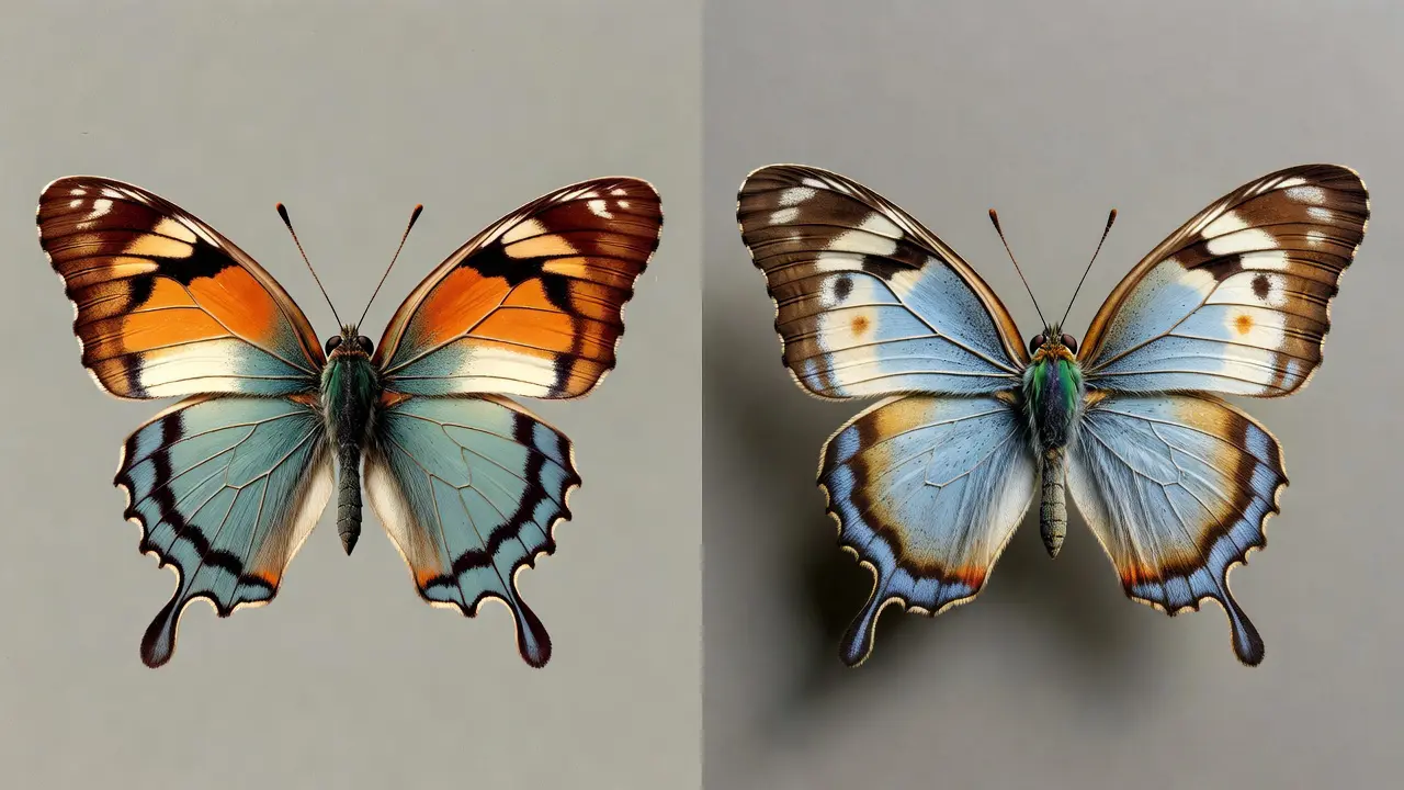
Shading and texture techniques have added so much dimension to my work. Pages now look almost three-dimensional.
The before and after examples are very motivating. Seeing what’s possible with these techniques inspired me to practice.
Found the site through a review and it lived up to the recommendation. The botanical and floral pages are especially lovely.