Looking for more than just a palette generator? Visit our
Free Creative Resources – Ultimate Coloring & Tools Hub
for coloring pages, templates, and every creative tool in one place.
What Is a Color Palette Generator?
A color palette generator is a tool — digital or physical — that helps you identify, create, and organize groups of colors that work harmoniously together. Rather than guessing and hoping for the best, you follow proven color relationships: complementary, analogous, triadic, split-complementary, and more.
Think of it as having a professional designer’s instinct, built into a structured system you can use anytime.
Modern color palette builders let you:
- Start from a single anchor color and generate a full palette automatically
- Explore color relationships using established color theory principles
- Export color codes (HEX, RGB, CMYK) for digital or print use
- Save and organize palettes for ongoing projects
Whether you’re working digitally or with paint, markers, or fabric, a reliable color-combination maker gives you a starting point grounded in visual logic rather than guesswork.
How to Use a Color Palette Maker: A Step-by-Step Approach
Step 1: Choose Your Anchor Color
Every great palette starts with one hero color — usually derived from your brand, your subject matter, or the emotion you want to evoke. If you’re a teacher creating a spring bulletin board, your anchor might be a soft sage green. If you’re branding a bakery, a warm terracotta could be the foundation.
Step 2: Define Your Color Harmony Type
This is where color theory pays off. A color palette maker typically lets you choose from:
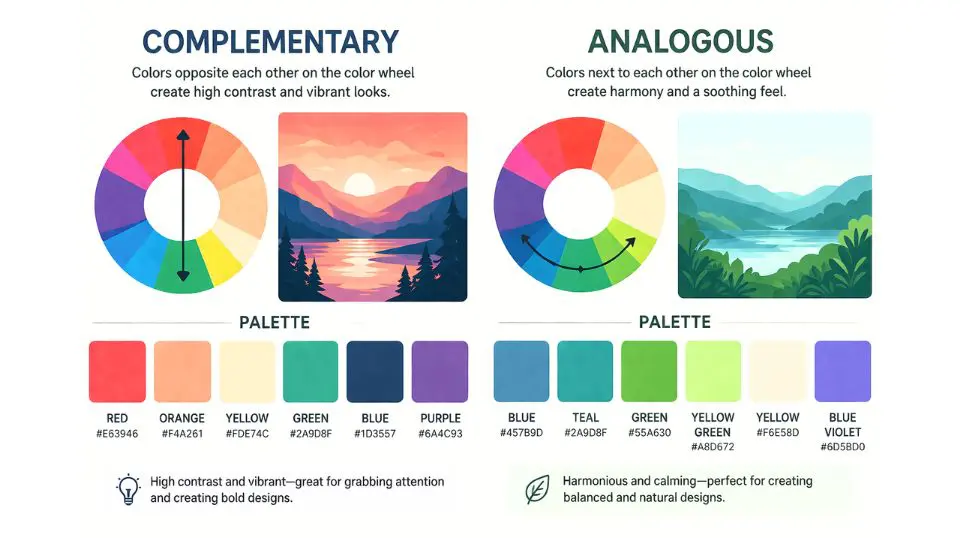
- Complementary — two colors opposite on the color wheel; bold and high-contrast
- Analogous — colors sitting side by side; gentle, cohesive, calming
- Triadic — three evenly spaced colors; vibrant and balanced
- Monochromatic — shades and tints of one color; sophisticated and elegant
Step 3: Adjust for Tone and Context
Raw color theory gives you structure, but real-world projects need nuance. Lighten pastels for a nursery theme, deepen jewel tones for a luxury brand, or desaturate earth tones for a natural, grounded aesthetic.
Step 4: Test Across Applications
Before committing, test your palette in context. Does it work on a white background and a dark one? Does it remain legible when printed? A good color combination maker will show you previews across different scenarios.
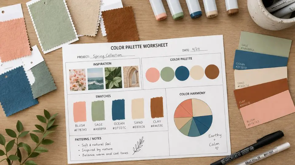
Step 5: Document and Save
Once you’ve landed on a palette you love, record the values. HEX codes for digital, CMYK percentages for print. This ensures consistency whether you’re posting on Instagram, printing business cards, or painting a classroom mural.
For additional tools, templates, and creative inspiration, visit our Free Creative Resources – Ultimate Coloring & Tools Hub — it’s packed with resources designed to help you work smarter and more beautifully.
Color Palette Strategies for Different Audiences
For Small Business Owners
Your brand palette is one of your most valuable assets. Consistency across your logo, website, packaging, and social media builds recognition — and recognition builds trust. A solid color palette builder lets you establish that consistency from day one, even if you’re working without a professional designer.
Research suggests it takes 5–7 brand impressions for someone to remember you. When those impressions share a unified color story, the recognition happens faster.
For Teachers and Educators
Color in educational environments is far more than decorative. Research in learning environments shows that color contrast supports readability, warm tones can stimulate engagement, and cool tones support focused, calm work. Using a color palette generator to design classroom materials — from anchor charts to bulletin boards to worksheets — creates a cohesive, visually organized environment that benefits students.
For Adults and Creative Hobbyists
Whether you’re an illustrator, a crafter, or someone who simply loves working with color, a structured approach helps you overcome the paralysis caused by too many choices. A color palette maker doesn’t limit your creativity — it liberates it, giving you a framework within which your instincts can flourish.
 Common Color Mistakes (And How to Avoid Them)
 Common Color Mistakes (And How to Avoid Them)
Using too many colors. Most effective palettes use 3–5 colors. More than that creates visual noise rather than harmony.
Ignoring neutral balance. Every palette needs breathing room — a warm white, soft cream, or cool gray that lets your hero colors shine without competing.
Forgetting about accessibility. Low-contrast color combinations are difficult to read for people with visual impairments. A good color combination maker will flag contrast issues so your work is inclusive by design.
Matching from memory. Color looks different in different lights and on different screens. Always test physically before committing to a large print run or production order.
Bring It All Together
The right colors don’t just make your project look better — they make it communicate better. A well-built palette conveys professionalism, personality, and purpose before a single word is read. With the right color palette generator, you don’t need a design degree to achieve those results.
Ready to go deeper? Explore our full collection of creative tools and resources at the Free Creative Resources – Ultimate Coloring & Tools Hub and start building palettes that truly represent your vision.
Frequently Asked Questions
Q1: What is a color palette generator, and how does it work?
A: A color palette generator is a tool that helps you create harmonious groups of colors based on established color theory principles. You typically start with one anchor color, choose a harmony type — complementary, analogous, triadic, or monochromatic — and the generator produces a coordinated set of colors. Most modern color palette generators also provide HEX, RGB, and CMYK codes so you can use the palette consistently across both digital and print projects.
Q2: Can I use a color palette builder even if I have no design background?
A: Absolutely. A color palette builder is specifically designed to take the guesswork out of color selection. You don’t need formal training — the tool applies color theory for you, so even beginners can produce professional-looking results. Teachers, hobbyists, and small business owners with no design experience use palette builders every day to create polished, cohesive visuals.
Q3: How many colors should I include in a palette?
A: Most designers and color palette makers recommend working with 3 to 5 colors. This typically includes one primary or hero color, one or two supporting colors, and one or two neutrals for balance. Keeping your palette within this range prevents visual overwhelm and makes your designs feel intentional and cohesive rather than chaotic.
Q4: What’s the difference between a color combination maker and a color palette builder?
A: The terms are often used interchangeably, but a color combination maker usually focuses on generating specific color pairings or groupings — great for quick decisions. A color palette builder typically offers a more comprehensive workflow, including saving, organizing, and exporting full palettes in multiple formats. For ongoing projects such as brand identity or classroom design, a full palette builder offers more flexibility and consistency.
Q5: How do I choose the right color palette for my brand or business?
A: Start with the emotion or message you want to communicate. Bold, saturated colors project energy and confidence. Soft, muted tones feel approachable and calm. Earth tones suggest authenticity and groundedness. Once you have your emotional direction, a color palette generator can help you build a full set of coordinated colors that reinforce your brand identity across every touchpoint — from your logo to your packaging.
Q6: Are color palette tools useful for classroom and educational materials?
A: Yes — color is one of the most effective and underused tools in education. A color palette maker helps teachers create visually consistent materials that are easier for students to process and remember. Research in educational environments supports using color contrast to improve readability and organizing information by color to help students navigate complex content. A structured palette also ensures that bulletin boards, worksheets, and presentations feel cohesive rather than visually scattered.
Looking for more creative tools and inspiration? Visit our Free Creative Resources – Ultimate Coloring & Tools Hub for everything you need to create with confidence.
I’ve been using the palette generator for two weeks now and it’s changed how I approach new pages. Starting with a planned scheme rather than reaching for whatever pencil looks appealing produces noticeably better results.
Great content! The printables look high quality and I’m excited to try them out.
I used the generator to plan the color scheme for a jungle page set and it made the whole process so much faster. Wonderful tool.
Helpful for avoiding the trap of reaching for the same colors every time. The contrast checker feature is a nice touch.
I had no formal art background and this made everything feel accessible and exciting.