If you want to improve your artistic skills, understanding the fundamentals of color is essential. A well-structured tutorial can help you unlock the logic behind beautiful designs, whether you’re creating digital art, coloring pages, or illustrations. Learning how colors interact allows you to make intentional choices that elevate your work from basic to professional.
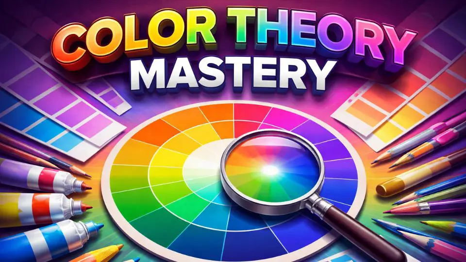
At its core, the theory of color explains how different hues relate to each other on the color wheel. Primary, secondary, and tertiary colors form the foundation, while concepts like complementary and analogous color schemes guide harmonious combinations. By studying these principles, you gain the ability to create balance, contrast, and visual interest in any creative project.
A good tutorial will also introduce key elements such as saturation, value, and temperature. Warm colors like reds and oranges evoke energy and emotion, while cool tones like blues and greens bring calm and depth. Understanding these emotional effects is a powerful tool, especially if you’re designing artwork meant to inspire specific moods.
For deeper learning, using color theory can be incredibly valuable. Books provide structured guidance, exercises, and real-world examples that help reinforce your knowledge. Many artists rely on a trusted color theory as a long-term reference to refine their skills and experiment with new techniques.
For a complete set of tools and printables to put your new color knowledge into practice, explore our Free Creative Resources – Ultimate Coloring & Tools Hub.
Applying color theory in practice is where real growth happens. Try experimenting with different palettes in your coloring pages or digital designs. Test how light and dark variations affect your composition, or explore how contrasting colors can make elements stand out. These small experiments build confidence and improve your creative intuition over time.
In conclusion, mastering color doesn’t happen overnight, but consistent practice with a solid tutorial and guidance from a reliable color theory book can make a huge difference. By understanding the theory of color, you’ll gain the skills needed to create visually stunning and emotionally engaging artwork that truly stands out.
FAQs
Love what you built with the color palette generator? Keep the momentum going.
Our coloring bundle brings you 400+ designs across every style and skill level.
So you never run out of pages to love.
This color theory book combines a clear, step-by-step tutorial with practical worksheets to help you truly understand and apply color with confidence. Whether you’re just starting or refining your skills, you’ll gain the tools to create balanced palettes, explore harmony, and use color with purpose in every piece you create.
Conclusion
Understanding the principles explored throughout this color theory tutorial is just the beginning of a lifelong journey into the world of color. Whether you are a seasoned designer, a budding artist, or simply someone who has always been fascinated by the way hues interact on a canvas or screen, the knowledge you have gained here will fundamentally transform the way you see and use color in your creative work.
From the foundational concepts of the color wheel to the nuanced relationships between complementary, analogous, and triadic palettes, this tutorial has walked you through the essential building blocks that every creative professional needs to master. These are not arbitrary rules — they are insights refined over centuries of artistic inquiry, rooted in the very science of human perception.
If you wish to deepen your understanding even further, exploring a dedicated color theory book is highly recommended. Works by Josef Albers, Johannes Itten, and other pioneering thinkers offer rigorous, beautifully illustrated explorations of how color behaves in different contexts. Reading these texts alongside your practical experiments will accelerate your growth in ways that no single tutorial can achieve on its own.
It is also worth revisiting the foundational ideas laid out in Goethe’s landmark theory of colour, which challenged purely scientific approaches and introduced the psychological and emotional dimensions of color experience. His emphasis on how color affects human feeling and mood remains deeply relevant to designers and artists working today.
Ultimately, color is both a science and an art. The more you practice, observe, and question the colors around you, the more intuitive your decision-making will become. Keep experimenting, stay curious, and let the principles you have learned here guide you toward bolder, more intentional, and more expressive creative work.
The tips on blending and shading have transformed how I approach my coloring projects. So helpful!
The interactive wheel made something click for me that years of reading color theory never had. I came back to this page three times while working on a project.
Really well thought-out tutorial. The analogous palette section helped me put together a set of ocean pages that looks genuinely cohesive.