 Start from the Sacred Center. When practicing mandala coloring, begin at the center and work your way outward. This mirrors the natural symmetry of mandala designs, helping to establish a calming rhythm. Starting in the middle also allows you to patiently build a harmonious color palette, making each layer feel like a natural extension of the last, and inducing a sense of relaxation.
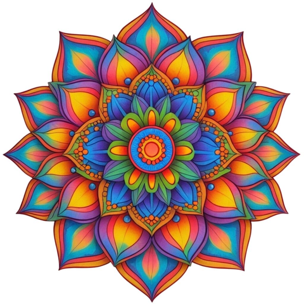
Master the Light-to-Dark Gradient. Use soft, light tones in the center to create a gentle focal point. These could be pastel colors or lighter shades of a particular color. Then, as you move outward, deepen or vary your shades. This means you can start using darker or more intense versions of the colors you used in the center, or even introduce new colors. This technique promotes focus and mindfulness, making it ideal for individuals who use mandala coloring as a form of meditation or stress relief.
Advanced Pro Techniques
Create Visual Flow with Color Temperature. Alternate between warm colors (reds, oranges, yellows) and cool colors (blues, greens, purples) in adjacent sections. This creates dynamic visual movement while maintaining balance. Warm colors naturally advance toward the viewer, while cool colors recede, adding dimensional depth to your mandala.
Perfect Your Pressure Control: Vary your coloring pressure strategically. Use light pressure for delicate details and backgrounds, medium pressure for main elements, and firm pressure for bold accents or borders. This creates natural texture variation and prevents that flat, over-colored appearance that screams “beginner.”
Master the Blending Game. Invest in blendable mediums like colored pencils or alcohol markers. Create seamless color transitions by overlapping colors while they’re still workable. For colored pencils, use a colorless blender pencil or light pressure with a white pencil to smooth harsh lines between colors.
Strategic Pattern Recognition. Before coloring, study your mandala’s repeating patterns. Identify identical sections and develop a consistent coloring system for each pattern type. This prevents confusion mid-project and ensures perfect symmetry in your finished piece.
The Power of Negative Space: Don’t feel compelled to fill every space with color. Strategic use of white or uncolored areas creates breathing room and makes your colored sections pop with greater intensity. Sometimes less truly is more.
Color Theory Application Use complementary colors (opposite on the color wheel) sparingly for high-impact accents. Stick to analogous colors (neighbors on the color wheel) for 70% of your mandala to maintain harmony, then add 20% complementary colors for contrast, and 10% neutral tones for balance.
Professional Shading Techniques: Add dimension by imagining a consistent light source. Shade the “bottom” or “right” side of geometric shapes slightly darker, and leave highlights on the “top” or “left” sides lighter. This simple technique transforms flat designs into seemingly three-dimensional artwork.
Tools Matter More Than You Think. High-quality coloring tools make a dramatic difference. Fine-tip markers prevent bleeding, premium colored pencils lay down smoother color, and good paper prevents ghosting. Once you’re hooked, consider investing in artist-grade materials.
Mindfulness and Environment Optimization
You can create a dedicated coloring area with proper lighting (natural light or a daylight lamp), comfortable seating, and organized supplies within arm’s reach. A consistent environment signals your brain that it’s time to relax and focus.
The 20-20-20 Rule for Eye Health: Every 20 minutes, look at something 20 feet away for 20 seconds. This prevents eye strain during longer coloring sessions and keeps you fresh for detail work.
Document Your Color Combinations: Keep a color journal or take photos of successful color combinations. This will build your personal palette library and help you recreate favorite effects in future projects.
Progressive Complexity Training: Start with simpler mandala designs and gradually work up to more intricate patterns. This will systematically build your technique, confidence, and attention span rather than overwhelm you with complexity too early.
Ultimate Enhancement Strategies
Multi-Session Planning For complex mandalas, plan to complete them over multiple sessions. This prevents rushing, reduces hand fatigue, and allows you to approach each session with a fresh perspective and energy.
Texture Experimentation: Try different coloring techniques in different sections, such as crosshatching, stippling, circular motions, or directional strokes. This adds visual interest and showcases your developing skills.
Photography and Preservation: Document your finished pieces with high-quality photos in natural light. Consider framing your best work or creating a digital portfolio to track improvement.
Bonus Enhancement: Enhance your coloring experience by pairing it with soothing music, aromatherapy, or a cup of herbal tea. This added comfort will make your relaxation even more profound and create positive associations that draw you back to the practice regularly.
Remember: The goal isn’t perfection—it’s the meditative journey and personal satisfaction that come from creating something beautiful with your own hands.
The creative decisions in coloring engage my mind without exhausting it.
This article articulates the peaceful immersion I experience while coloring.